Pingala Cafe
Foodtruck Inspired Vegan Flavorgasm
+
When Pingala Cafe reached out to us to talk branding, we were hungry AF. Working with Chef/Owner/Visionary Trevor, we started by defining the goals of the project and aligned on what we were trying to communicate.
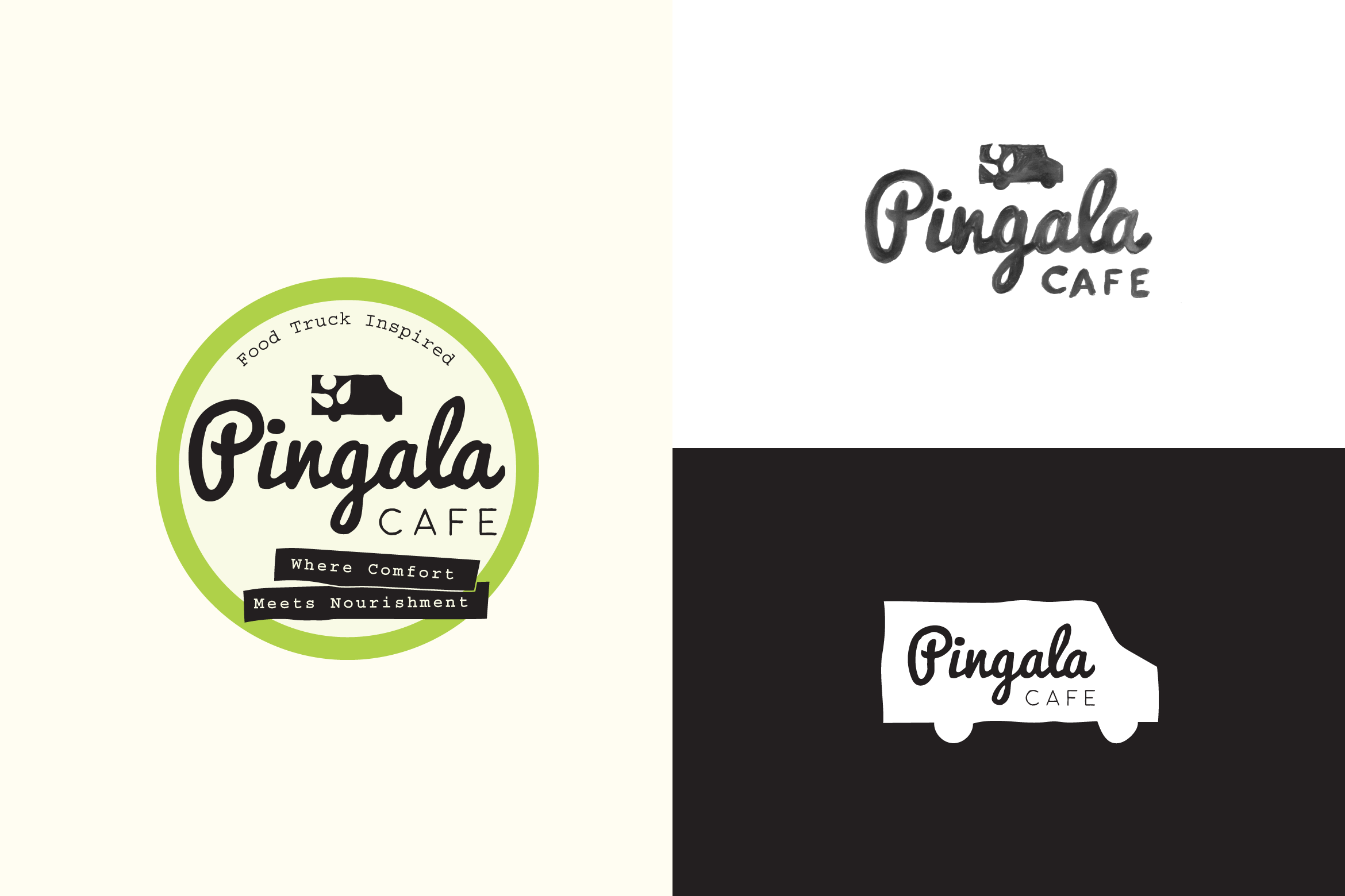
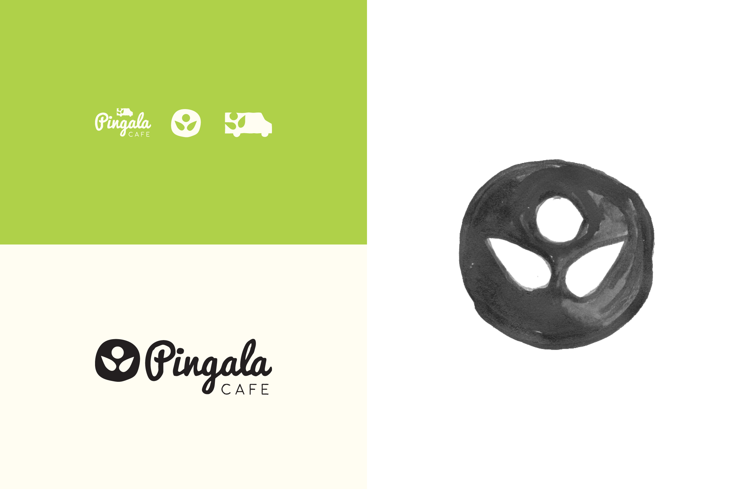
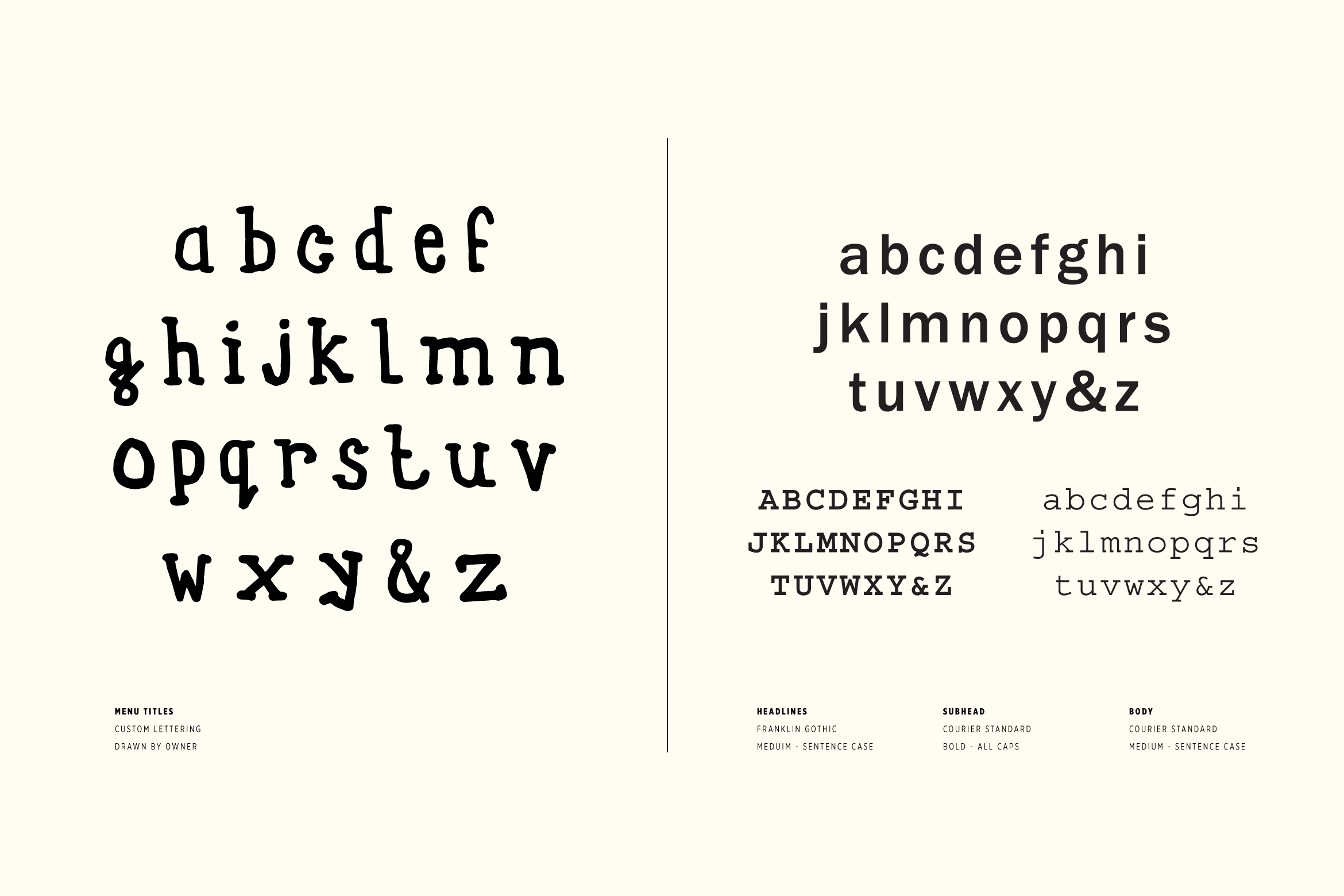
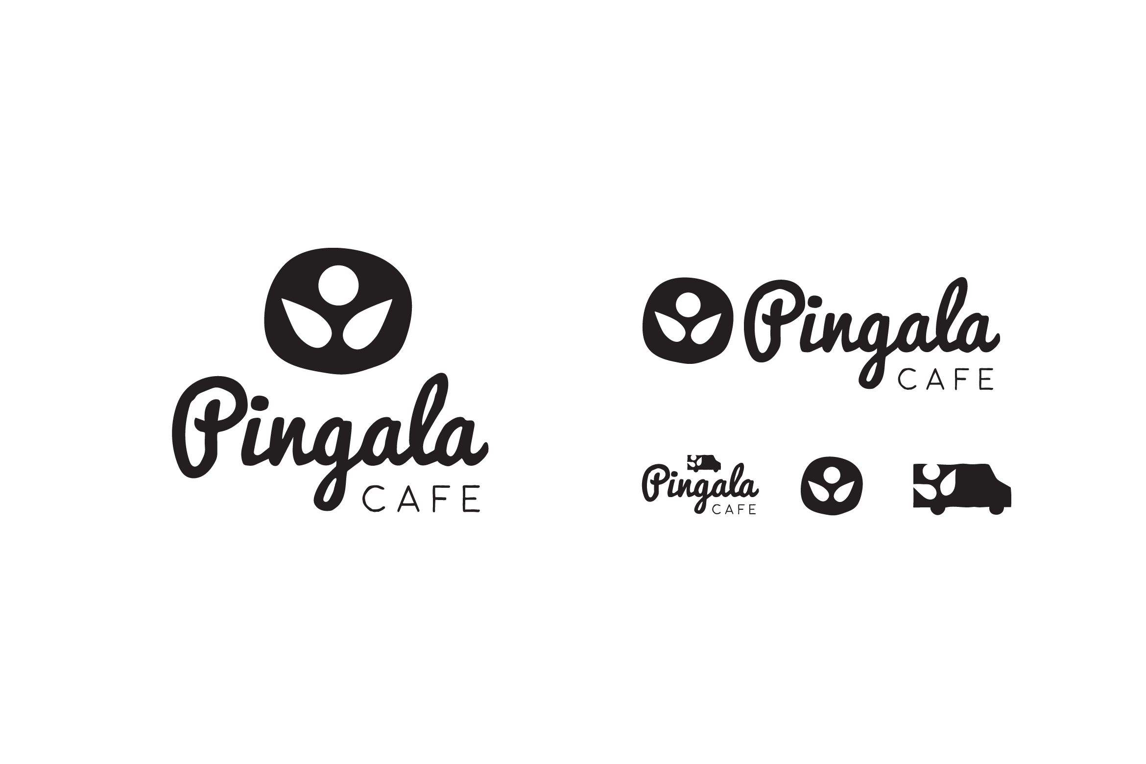
We developed a variety of logos and icons, determined an energetic color palette, and even created a font from Trevor's handwriting.

—
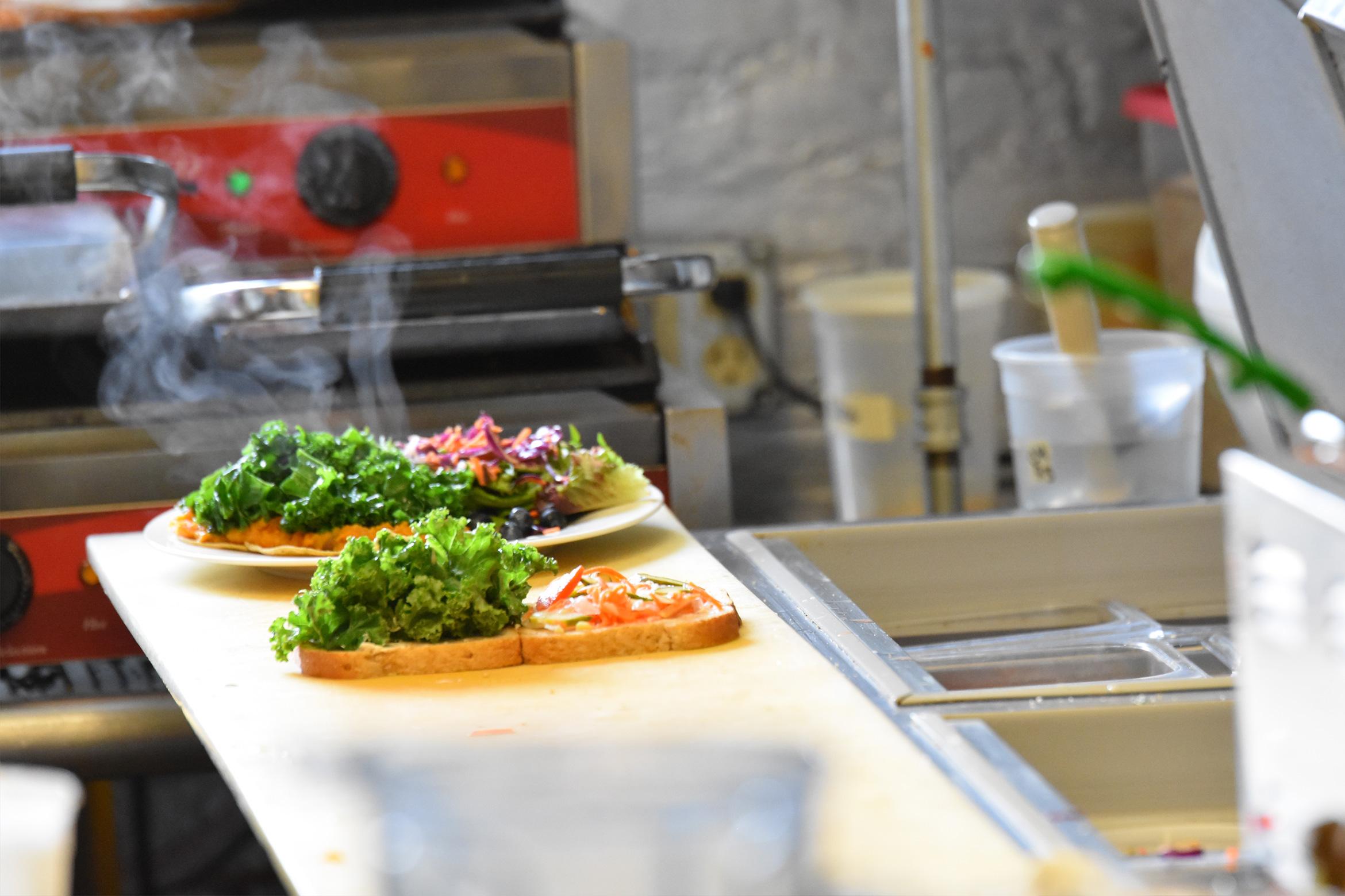
The food is quick, comforting, and energetic. The place naturally has a food truck vibe, with the compact kitchen and ordering window, so bringing some of that energy into the branding seemed like a good idea.
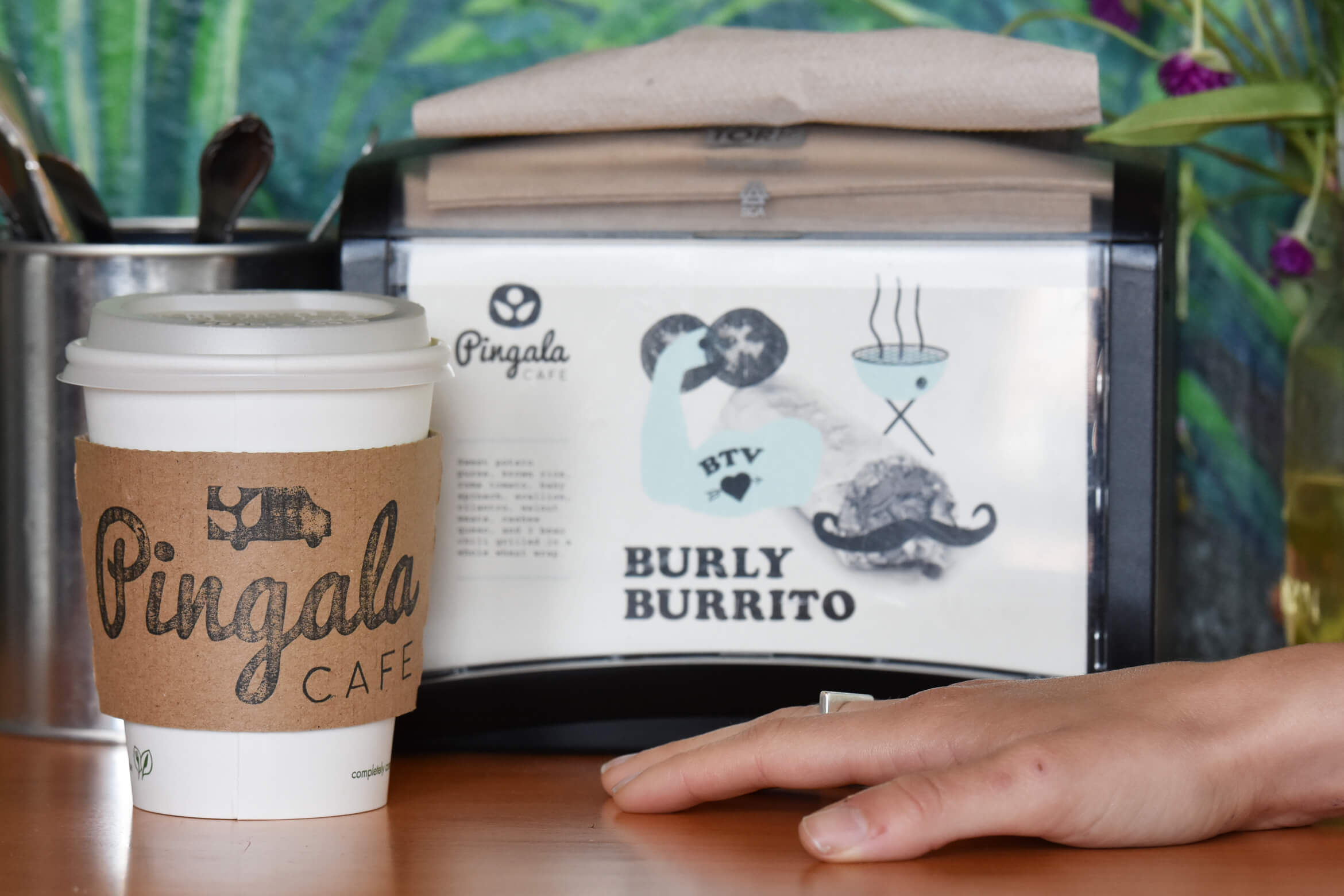
We developed an illustration for each of Pingala's Signature Sandwiches. These were printed as postcards for napkin holders and used online.

—
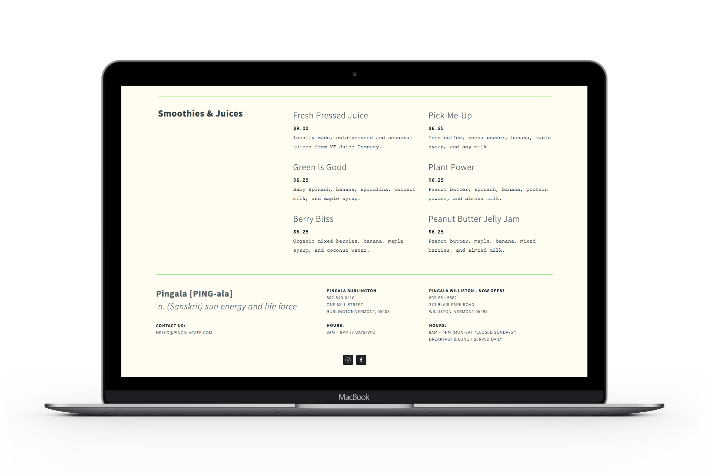
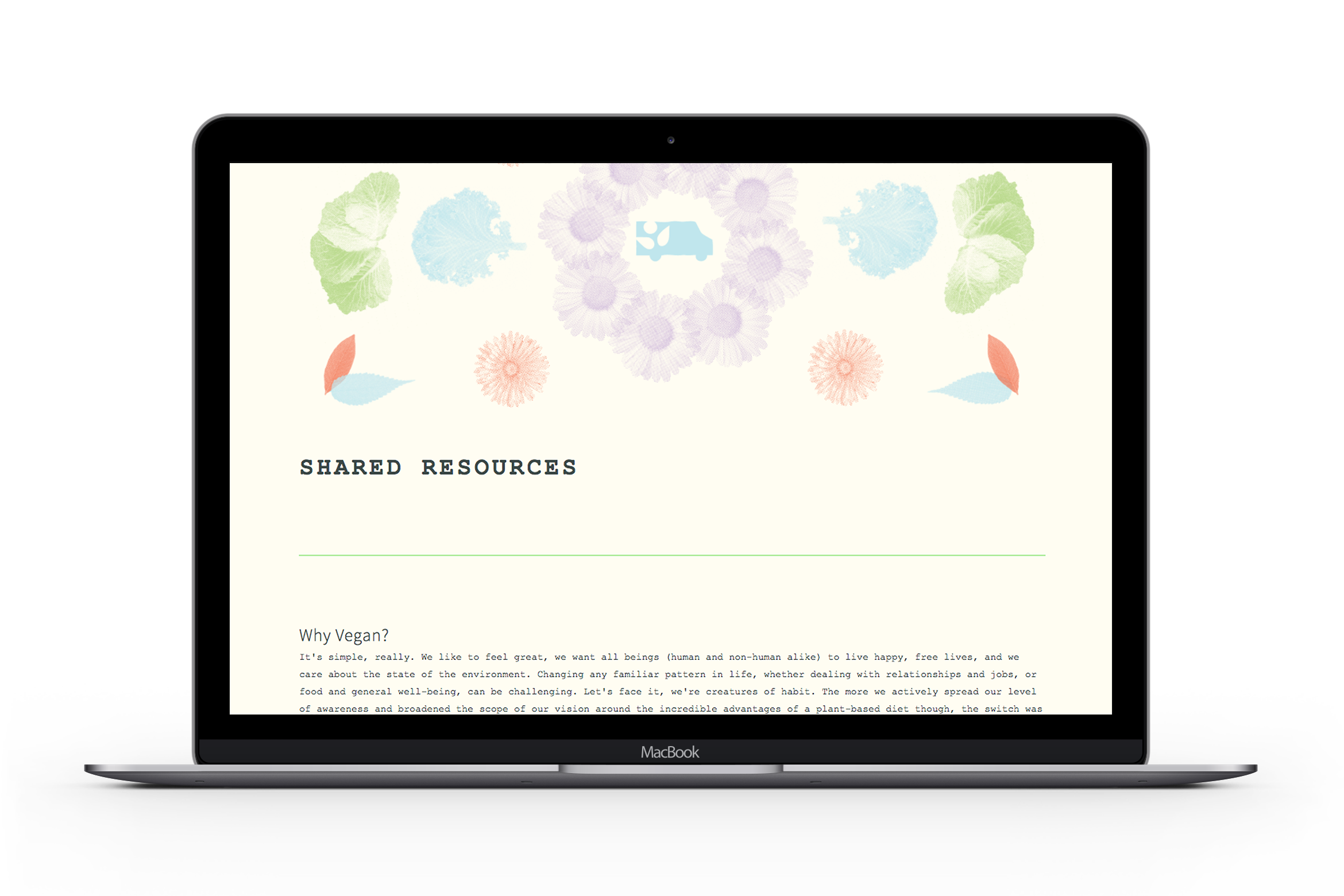
Obviously a thriving business needs a great looking, functional website. We decided early on to forgo all the paralaxing web gimmicks, instead creating a straightforward site with great organization and consistent branding that would last a minute. See the full site here.
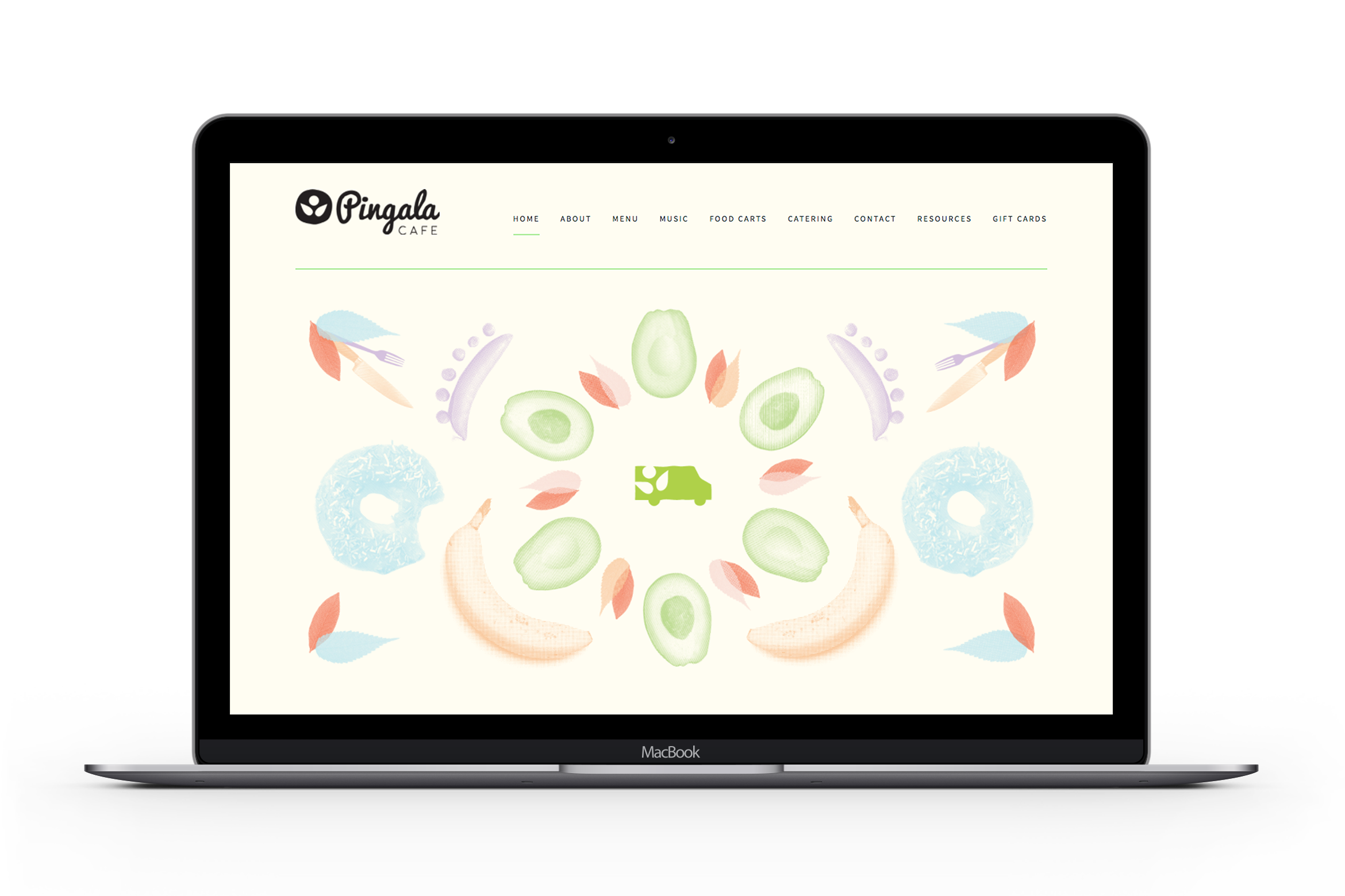
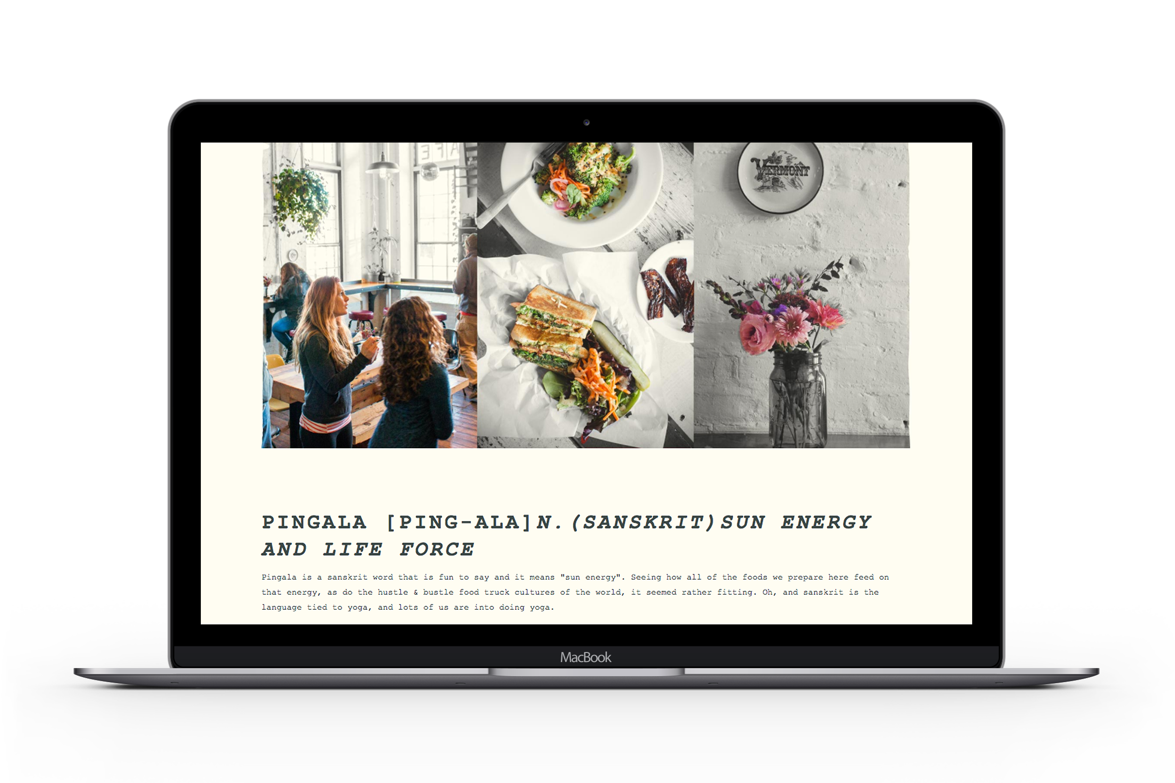
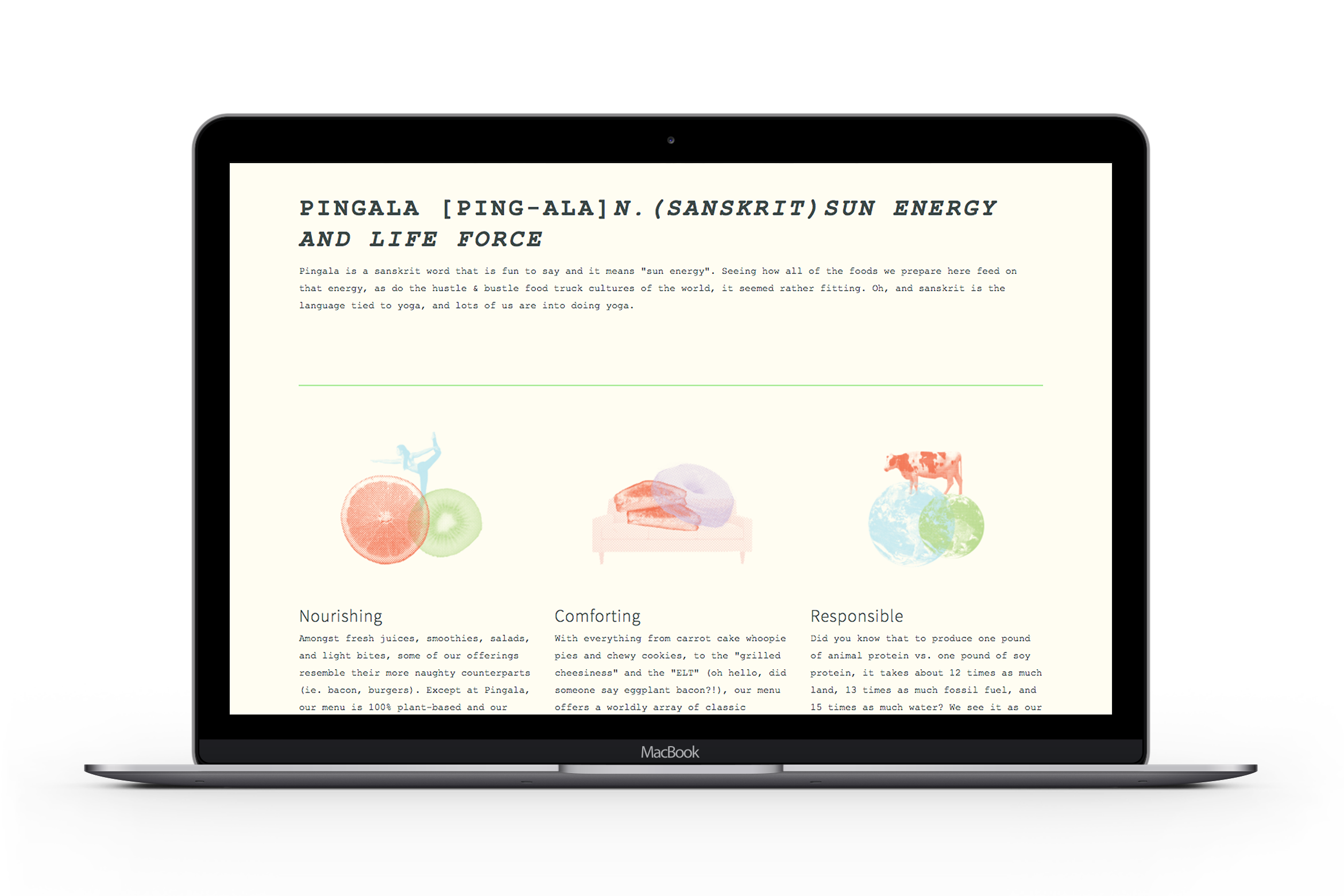
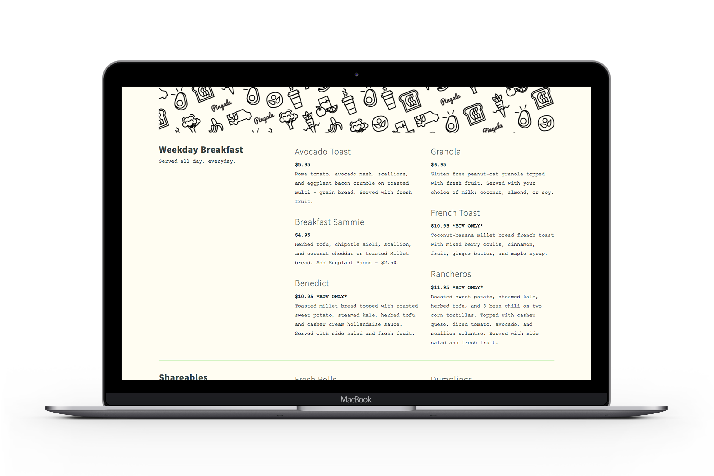

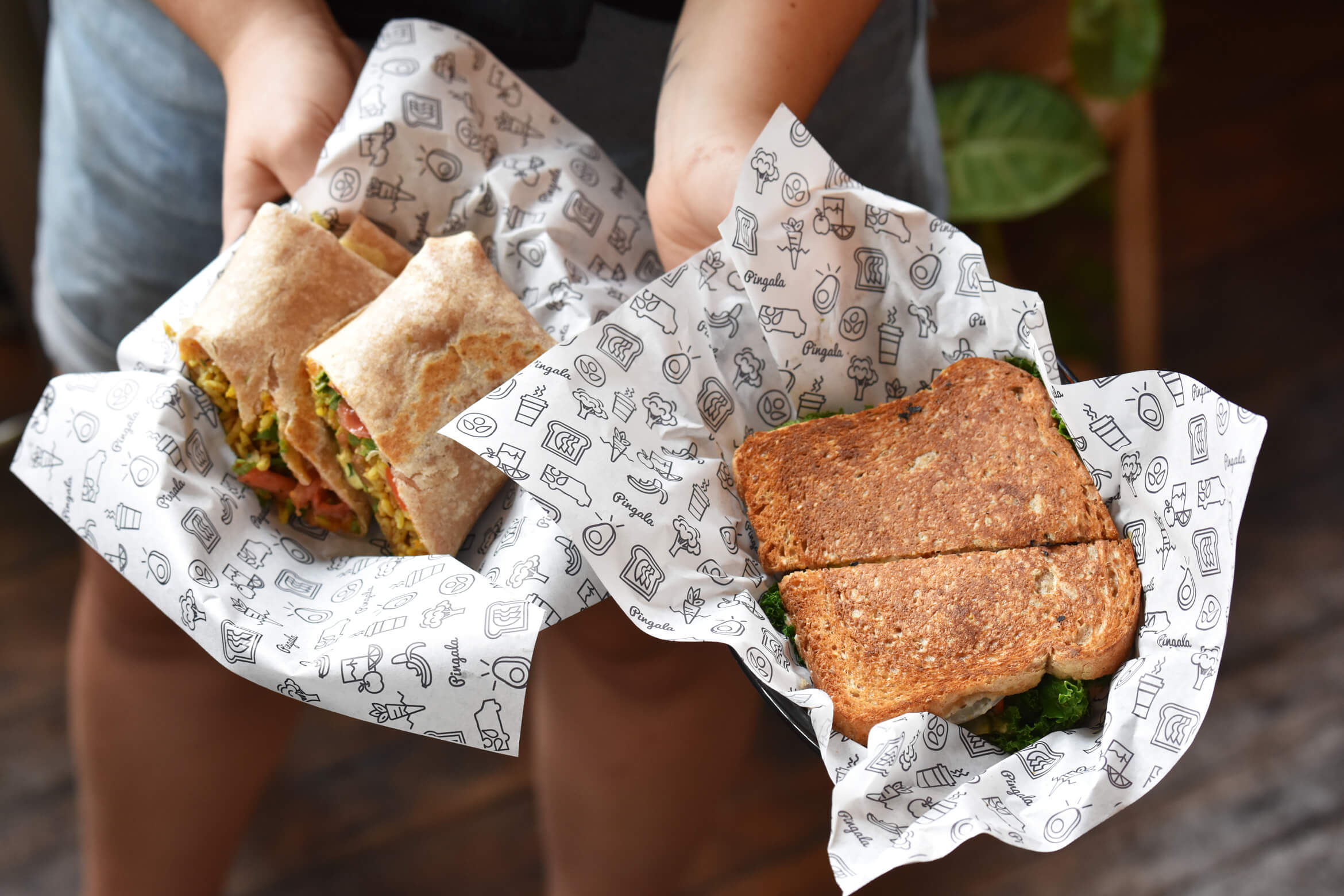
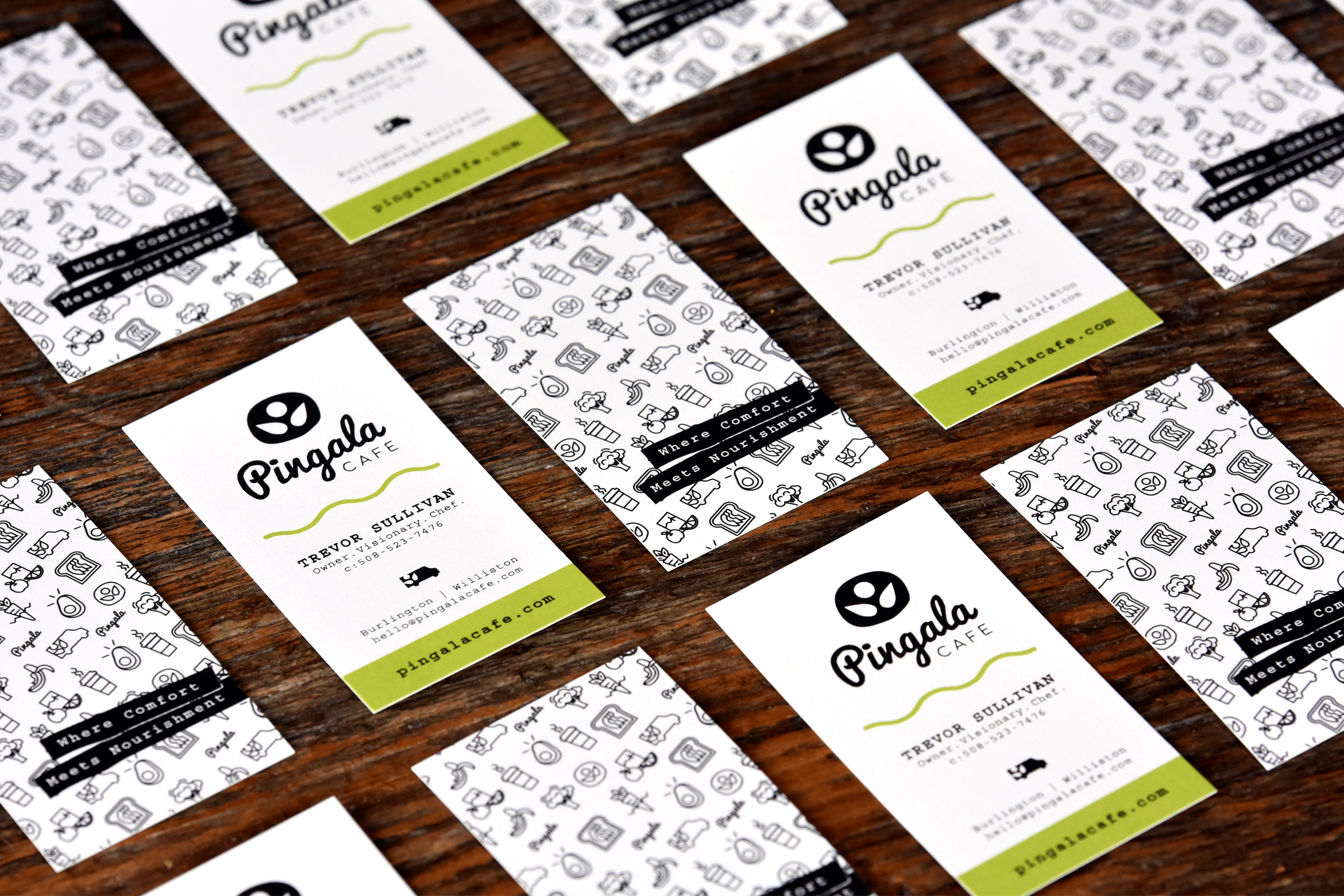
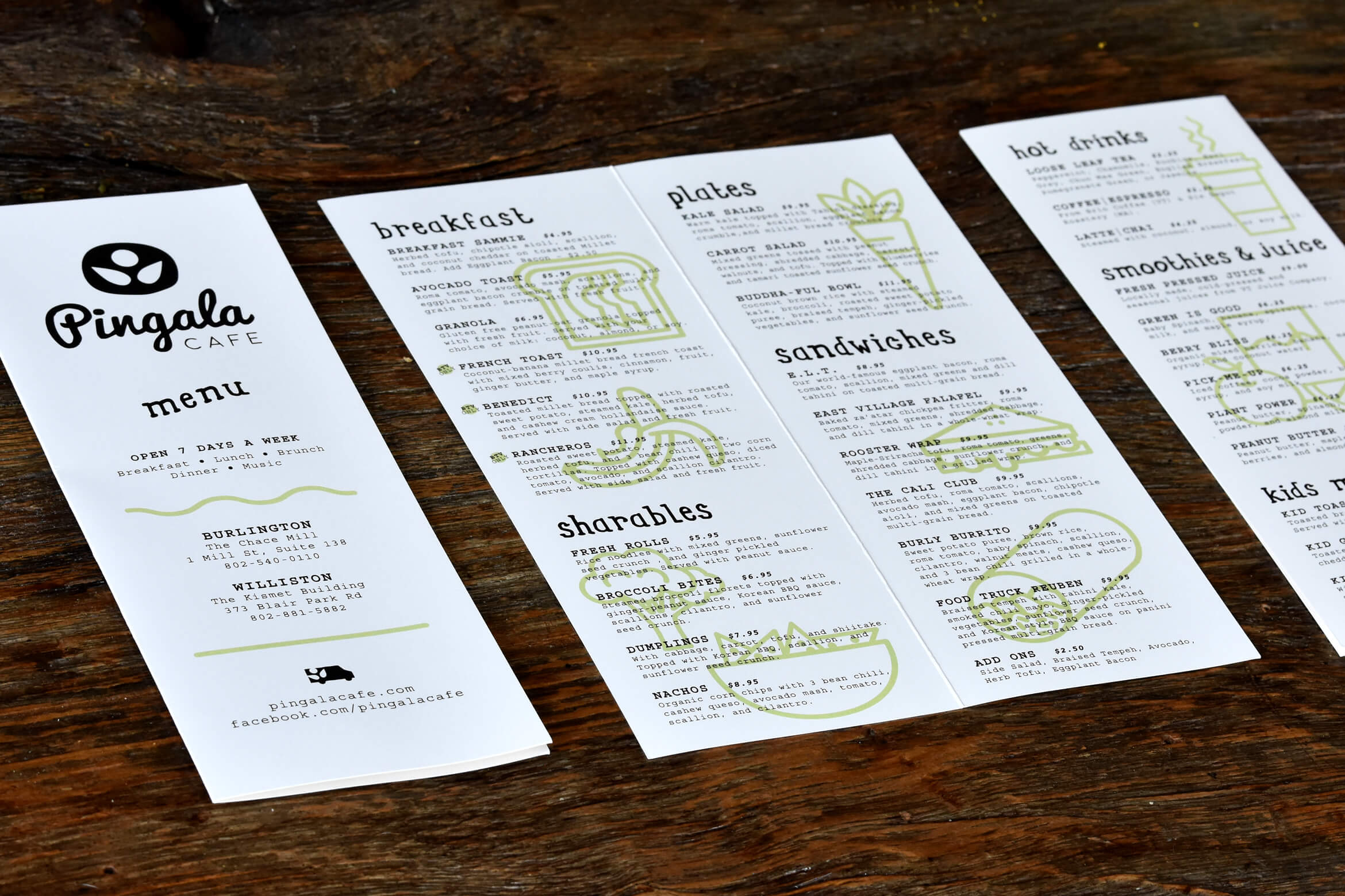
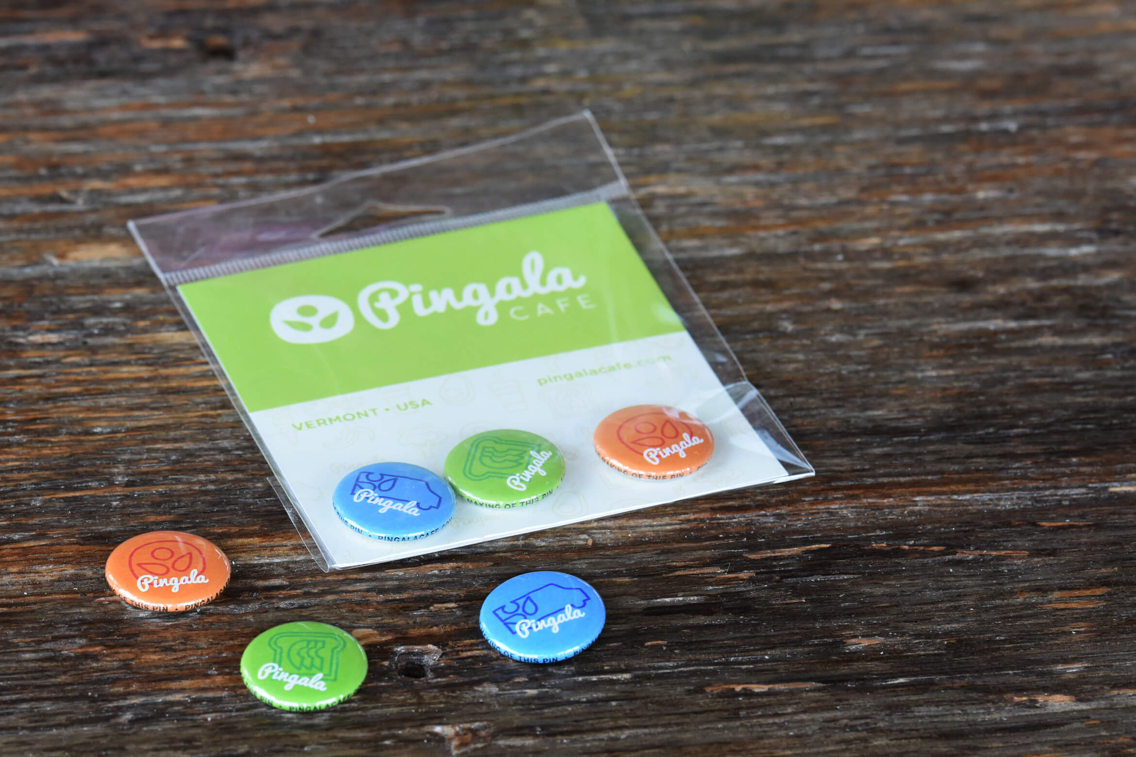
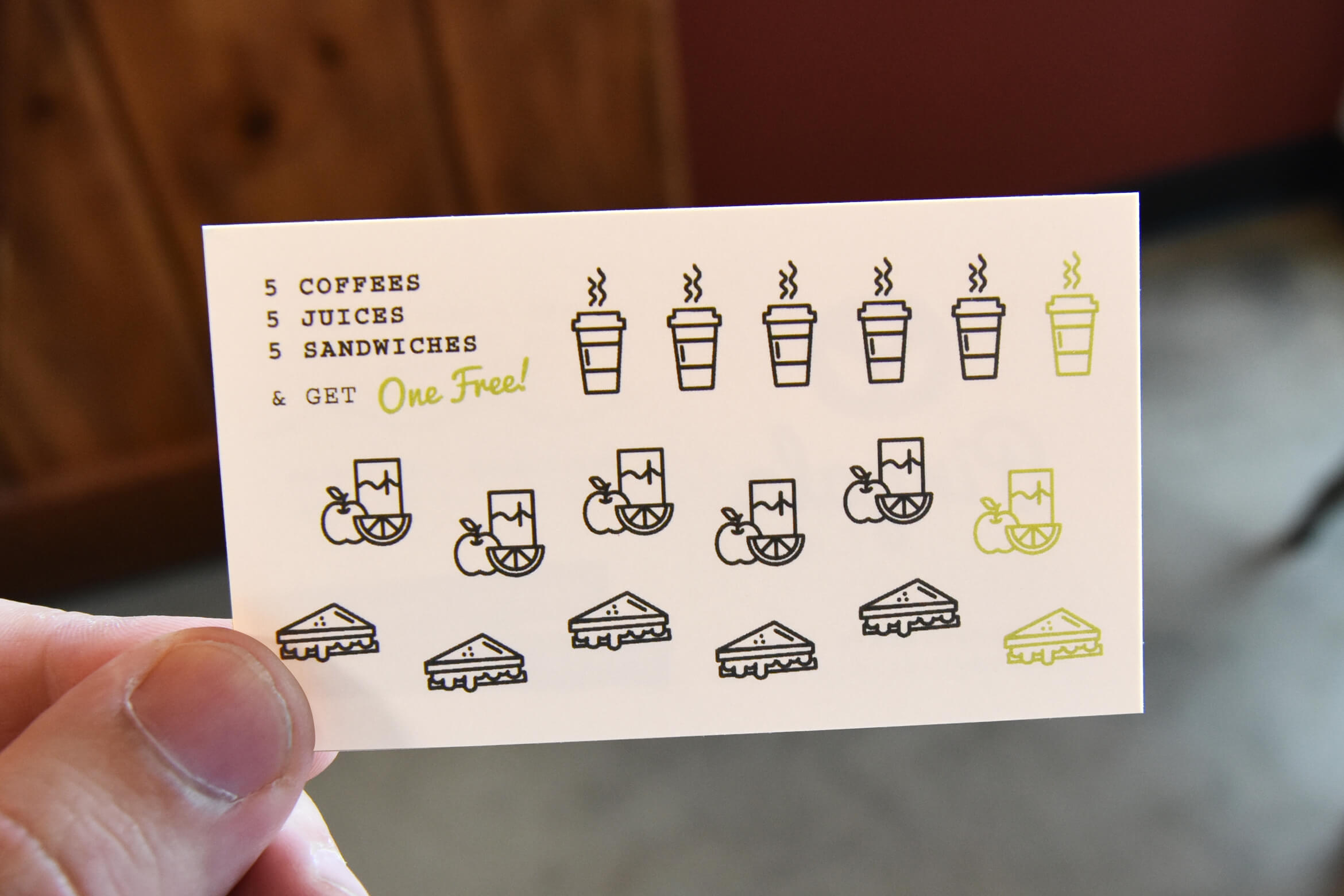
Printed matter, including take-out menus, custom patterned basket liners, business & punch cards, and illustrated highlights of signature sandwiches, all help to round out the Pingala brand. Keeping things fun and natural, we used bright colors printed on un-dyed stock.
—

This is a power couple that knows how to be efficient with all resources: time, money, creativity, and communication.
Trevor Sullivan, Pingala Cafe
Testimonial +
From start to finish, ESO Design simultaneously executed multiple projects with poise, confidence, and ease for my Restaurant group. Jeremy and Danielle work well as a team both in terms of understanding the clients' needs and offering their own creative input. On that note—I have never before worked with graphic designers that listen to and absorb a goal, offer ideas, process the vision, and execute in one fell swoop. This is a power couple that knows how to be efficient with all resources: time, money, creativity, and communication. I highly recommend their work for projects that need direct results and little management—these guys know how to conceptualize and fulfill a project's mission. I would and will hire them over and over again.
